
Branding & Experience
The Trustly Brand
Trustly is a safe, easy way to make payments and retrieve financial information on websites and mobile apps. By using their Online Banking credentials, users can authorize payments, confirm their identity, and grant controlled access to their financial information. Trustly patented technology ensures all credentials are securely encrypted and safeguarded so neither the merchant nor Trustly can access them.
In order to maximize end-user benefits and remain compliant with the brand and legal requirements, we request that merchants and partners adhere to the Trustly Brand and Experience Requirements along with the Trustly Presentation Standards. These requirements are best practices designed and proven to enhance the end-user experience and therefore contribute to a high conversion rate.
Trustly provides a highly customizable set of experience options. The examples below show some of what is possible. Trustly Experience Services are available to assist with determining the customization options that match your needs. Read more about how to customize your merchant branding.
Trustly Brand and Experience Requirements
Trustly provides hosted assets and pre-approved messaging to use on your site or app when providing or referring to Trustly and Trustly solutions. The use of Trustly hosted assets and pre-approved messaging is required to be compliant with Trustly as well as NACHA and other agency regulations and requirements, when applicable.
Websites and apps with Trustly solutions must display the applicable Trustly Mark wherever available payment and data options are shown and whenever the Trustly service is being introduced.
Where applicable, the Trustly Widget, Express Checkout Button, and Sign-In Button are also presented following the instructions for each asset.
Clicking on the Trustly Payment or Data Mark, presents the Trustly Widget if it's not already displayed. Selecting a bank tile on the Trustly Widget presents the Trustly Lightbox where users log in to their bank using their Online Banking credentials to grant data access or payment consent.
More information on each Trustly asset and element can be found below, along with experience styles to achieve the best possible Trustly experience for end-users in your website or app.
The Trustly Assets
Where and how Trustly appears within your website or app may vary slightly depending on your use case. The assets below are used to provide and promote Trustly to end-users. Using Trustly hosted assets is a requirement for certification and launch of your integration, so it is important to understand what the Trustly assets are and how they apply to your use case.
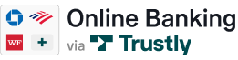
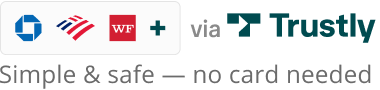
1. Trustly Mark
The Trustly Mark identifies Trustly as an available option to the end user and is typically displayed in the payment line up. A collection of mark variants in a wide range of footprints, colors, and content are available to match your experience context and can include the title of the method, an image, and a benefit message. The mark used depends on your user interface.
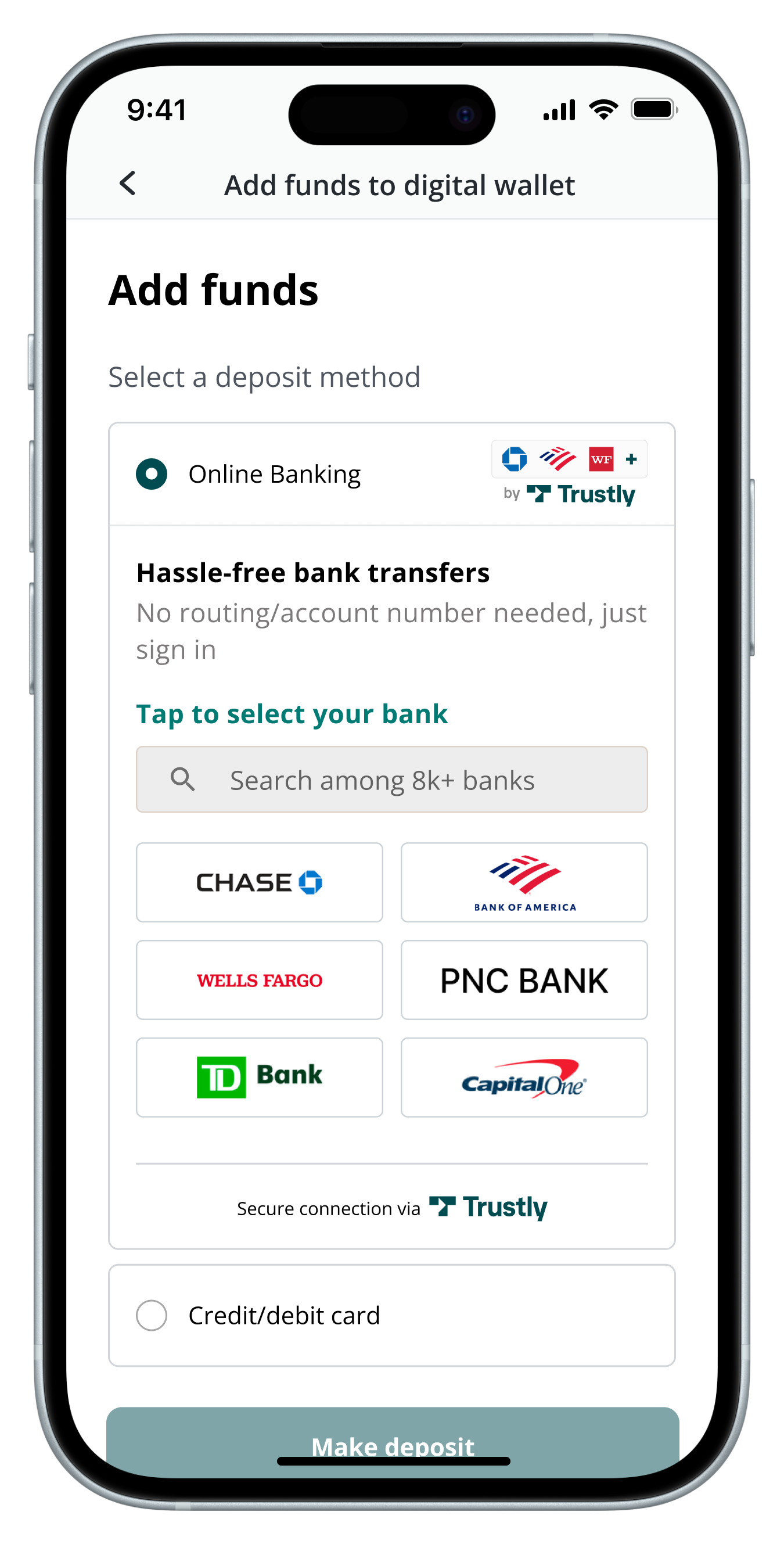
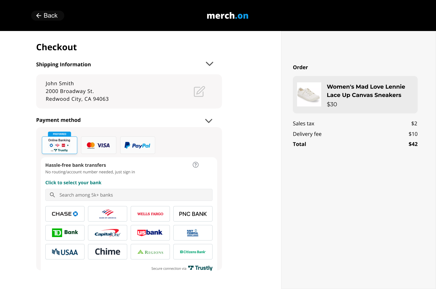
2. Trustly Widget
The Trustly Widget has selectable bank tiles for the most frequently used banks within your website or app. Presenting the Widget directly in the payment lineup creates a one-click user flow that drives maximum conversion. Additional banks can be chosen by selecting the "more banks" tile.
3. Trustly Lightbox
The Trustly Lightbox opens from the Widget (or from a call to action, see below) for the user to authenticate by logging in to their selected bank and choosing the bank account they want to use.
4. Trustly Buttons
Certain scenarios require the use of a button to initiate the Trustly payment method, like Express Check-Out. In these cases, Trustly provides branded buttons with service-specific messaging.
5. Trustly Notifications & Emails
Any notification, email, or other communication that mentions Trustly solutions, whether transactional or promotional, must use Trustly-approved messaging (e.g. for product naming). Speak with Trustly Marketing Services if you need help crafting the perfect message.
Trustly Mark
The Trustly Mark identifies Trustly as an available option to the end-user as an available payment option and can include the title of the method, an image, and a benefit message, depending on the use case and existing interface.
Trustly provides several asset styles which you can use in your app or website to communicate the availability of Trustly as a payment option or authentication service.
Always the use of approved Trustly Marks ensures:
- A mark that is guaranteed to use a Trustly-approved caption, font, color, and style
- That the mark’s contents maintain ideal proportions as you change its size
- The mark’s caption can be automatically translated (default: English)
WarningDo not create your own Trustly Mark design or attempt to mimic the system-provided button designs. Using the approved Trustly Marks ensures: In order to remain in compliance with the Trustly Branding Requirements, you must use the assets that are hosted on the Trustly CDN. It is not acceptable to host any of the Trustly assets in your own environment.
To comply with Trustly Brand and Experience Requirements, you must use assets hosted in the Trustly CDN. Hosting of Trustly assets in your own environment is not permitted.
The Mark Library has more information on available Trustly Marks and their specific use-cases, see. For guidance on customization options, refer to the Integration Best Practices section or work with Trustly Experience Services.
Trustly Hosted Assets - Mark Library
There are several approved hosted assets that you can leverage, depending on the layout of your payment lineup. They are listed below.
- Banners - Banners are typically used when you're showing Pay with Online Banking as a method of payment.
- Buttons - Buttons are typically used when you're providing a call to action to initiate the Trustly experience.
- Payment Marks - Payment Marks are typically used when you have a call to action to initiate the Trustly experience or want to show that Online Banking is available as a method of payment along with other methods of payment on your site.
|
|
|
|
|
|
NoteIf Trustly does not have a valid icon for a bank, Trustly provides a default bank icon instead. You can control the color of the default bank icon by adding a default query string parameter with a value of green, outline, black, or gray to the icon url defined above. If you don't specify a value, then green is used. For example, https://trustly.one/start/assets/institutions/icons/255075576.png?default=black.
If you have specific asset requirements that aren't shown here, contact your Account Team.
Trustly Hosted Strings - String Library
Trustly Hosted Strings will allow you to dynamically serve the non-graphic elements of the Payment Mark - the title, the benefit message, the learn more text - through a string provided by Trustly. More information on this topic can be found here.
Trustly Invisible Pixel
If none of the recommended assets can be integrated, Trustly will allow using an invisible pixel to track impressions of the payment page. This is a 1x1 transparent pixel that works like any brand or payment mark. It will be an image inside a URL within your environment. It’s possible to set other parameters for tracking purposes through alternative methods should the need arise. Speak with the Trustly Solutions team or your Engagement Manager to configure unique implementations.
The invisible pixel can be accessed here.
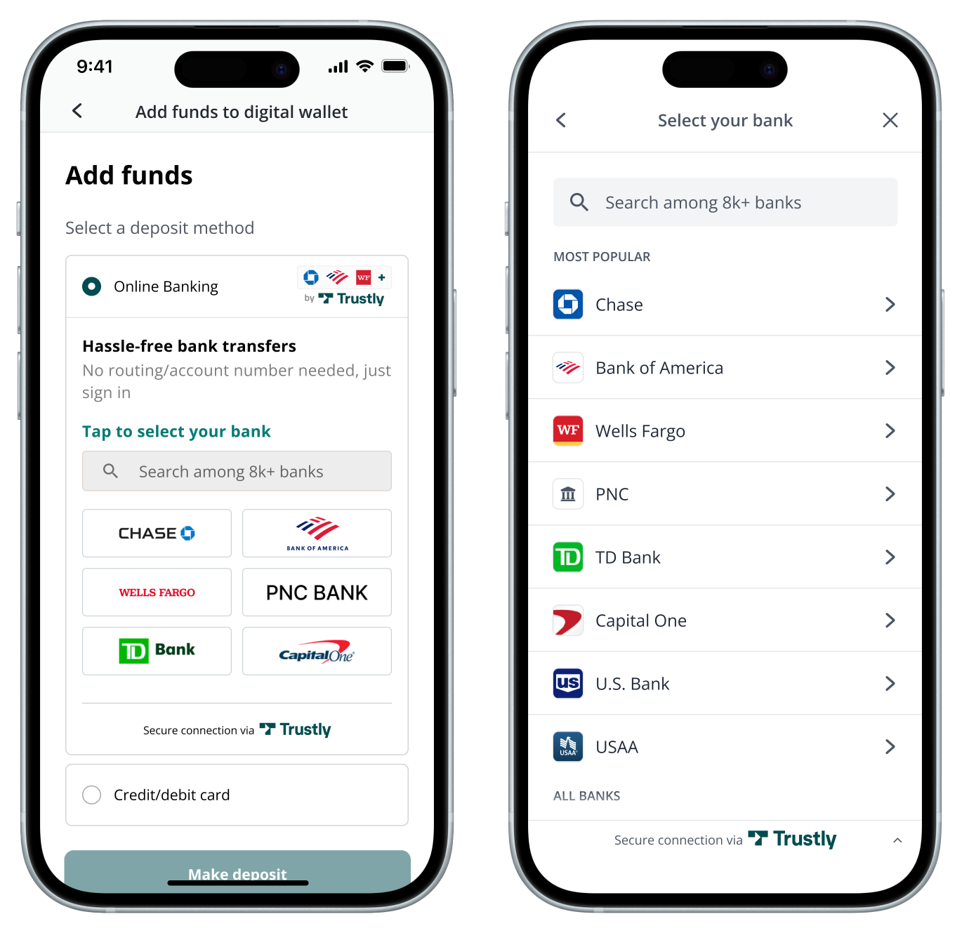
Trustly Widget
The Trustly Widget displays the top banks as 1-click tiles which maximize conversion. This step reduces a step in the checkout process for a majority of users and is highly recommended.
Desktop Widget Experience
Use the selectBankWidget function to display a Trustly Widget inline on your page which allows the User to select their bank. The SDK controls opening the Trustly Lightbox where the User will complete their Bank Authorization.
By default, the Trustly Widget displays 6 tiles in a 4x3 grid (2x3 grid on mobile devices). One of the spaces is always reserved for the "All other banks" tile, which opens the full list of available banks.
InfoDo not open a pop-up window to display the Trustly Widget. This can be accomplished with the Trustly Lightbox option described below.
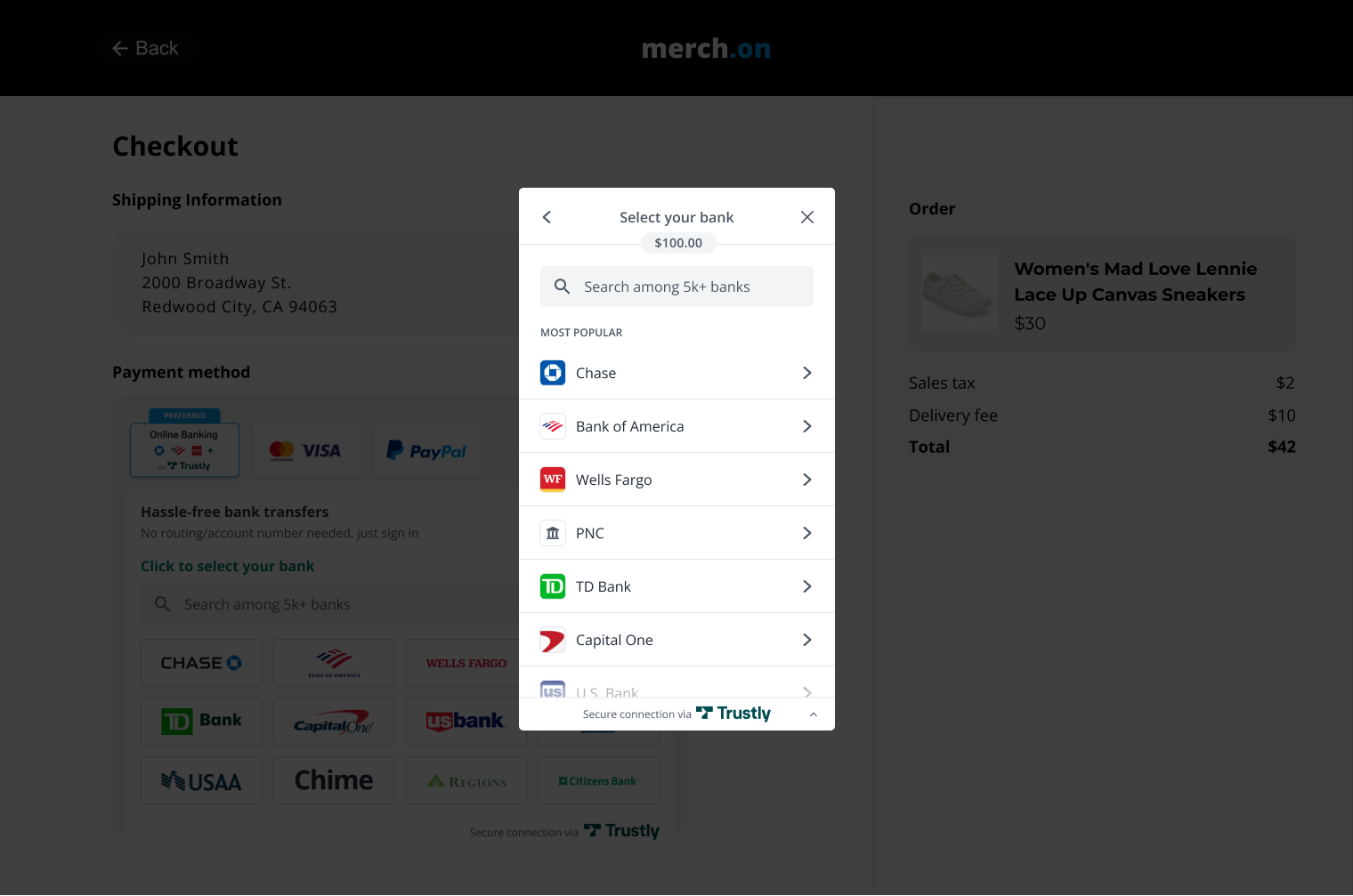
Trustly Lightbox
The Trustly Lightbox is recommended as a second step to the Widget, but in certain use-cases will be the first step (see below). The Lightbox is where the user logs in to the Online Bank and selects an account to use. If a bank is not already selected on the Widget, the Lightbox also displays a list of banks to choose from, including a search option that allows users to seamlessly find their regional bank that may not be in the 8-12 Top Banks listed in the Widget, and at the top of the list.
If the payment process is triggered by a call to action (i.e. a button to “Select Payment Method”) and directing the user to a payment flow where the Trustly Widget isn't applicable from a User Experience standpoint, you can launch the Trustly Lightbox directly from your call to action.
In either case, the user selects their bank from either the Lightbox or the Widget, then in the Lightbox authenticates (including multi-factor authentication when required), and selects their account. Then they are redirected to a Return Page in your site or app with a Success Message. More information on the Lightbox flow and what your users will see within the Trustly experience can be found in the Integration Best Practices and Available Customizations sections below.
Desktop Lightbox:
InfoIf you require the billing address for the transaction and it hasn't been collected, that should be retrieved using the Get User API and shown to the user once the Trustly experience is completed.
Trustly Buttons
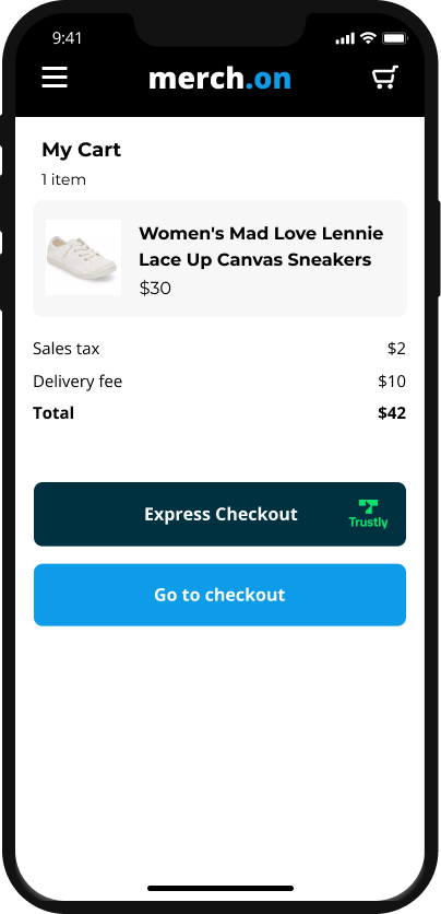
Express Checkout Button
Skip the checkout line! Presenting Trustly high in the funnel will reduce friction for users and help them checkout faster.
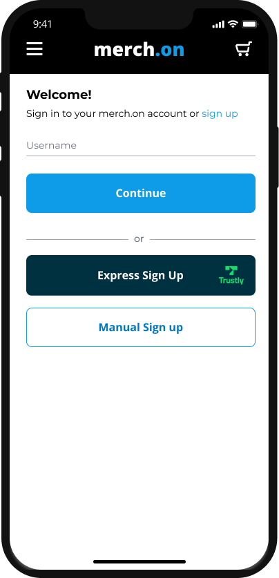
Trustly Sign-In Button
Sign in with Trustly allows users to perform an action without first having to create an account on your site, reducing friction.
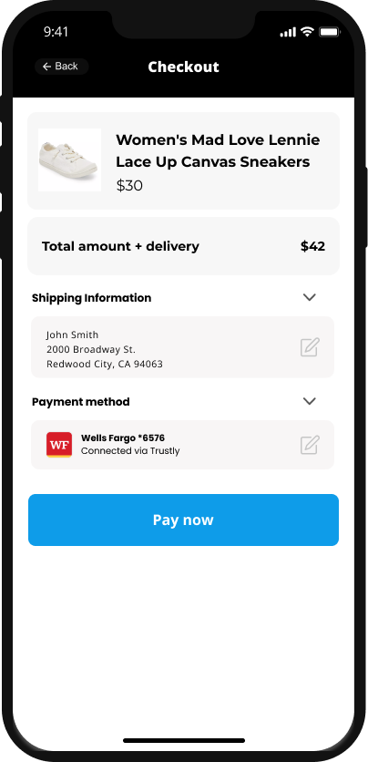
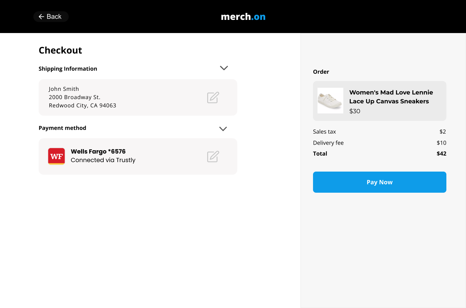
Account on File
You must display the Bank name or logo and Bank Account name when displaying the method of payment used with the transaction. These details will come from a Trustly API.
- The Bank name can be retrieved using the transaction.payment.paymentProvider.name field in the Get Transaction API.
- The Bank logo can be retrieved using the transaction.payment.paymentProvider.paymentProviderId field in the Get Transaction API and using the Image URL: For the Logo OR For the Icon
- The Bank Account name can be retrieved using the transaction.payment.account.name field in the Get Transaction API.
Desktop Account on File View
Updated about 6 hours ago